Favorite White Paint Colors – Woodside Manor Project
Paint Colors Used – Woodside Manor Project
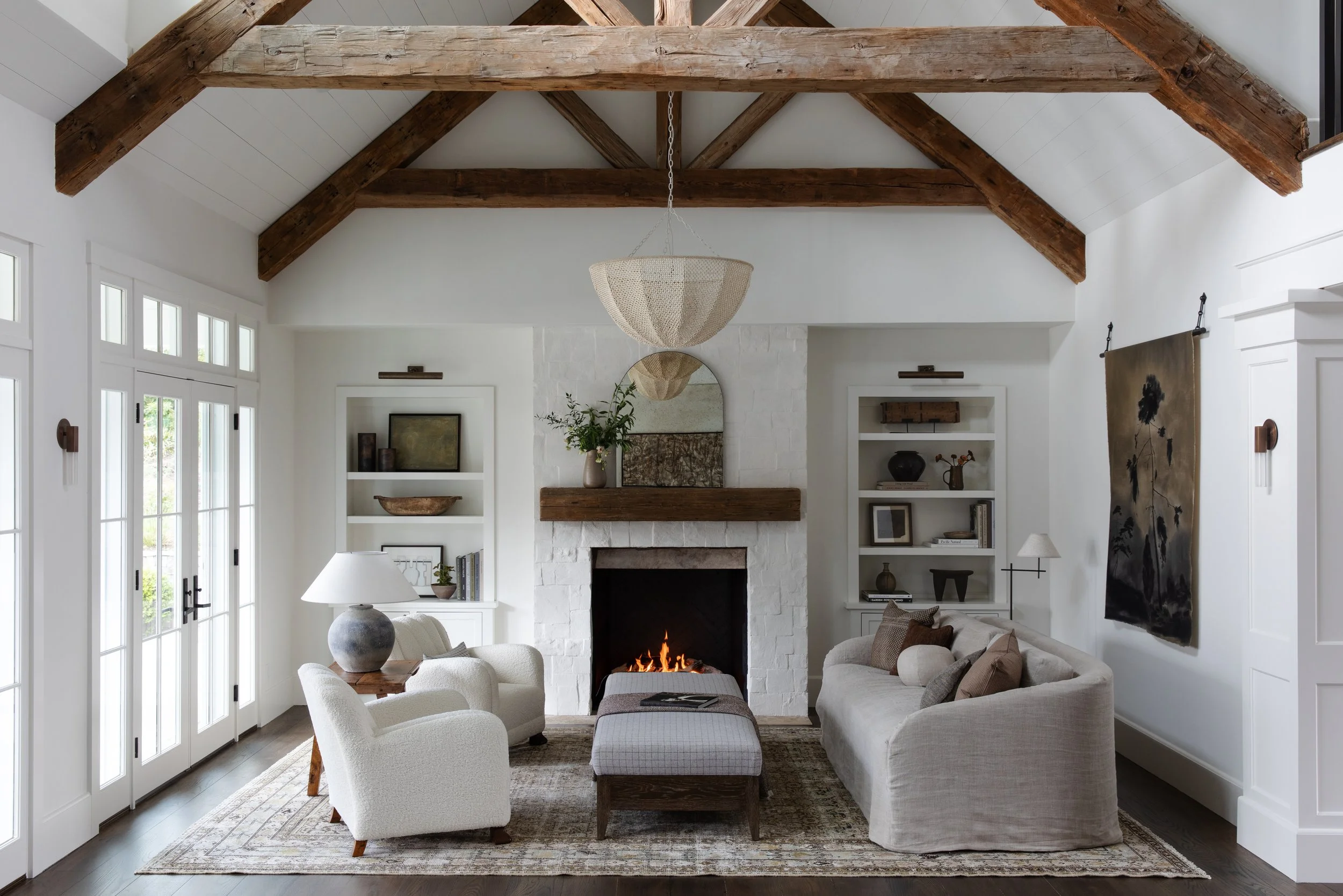
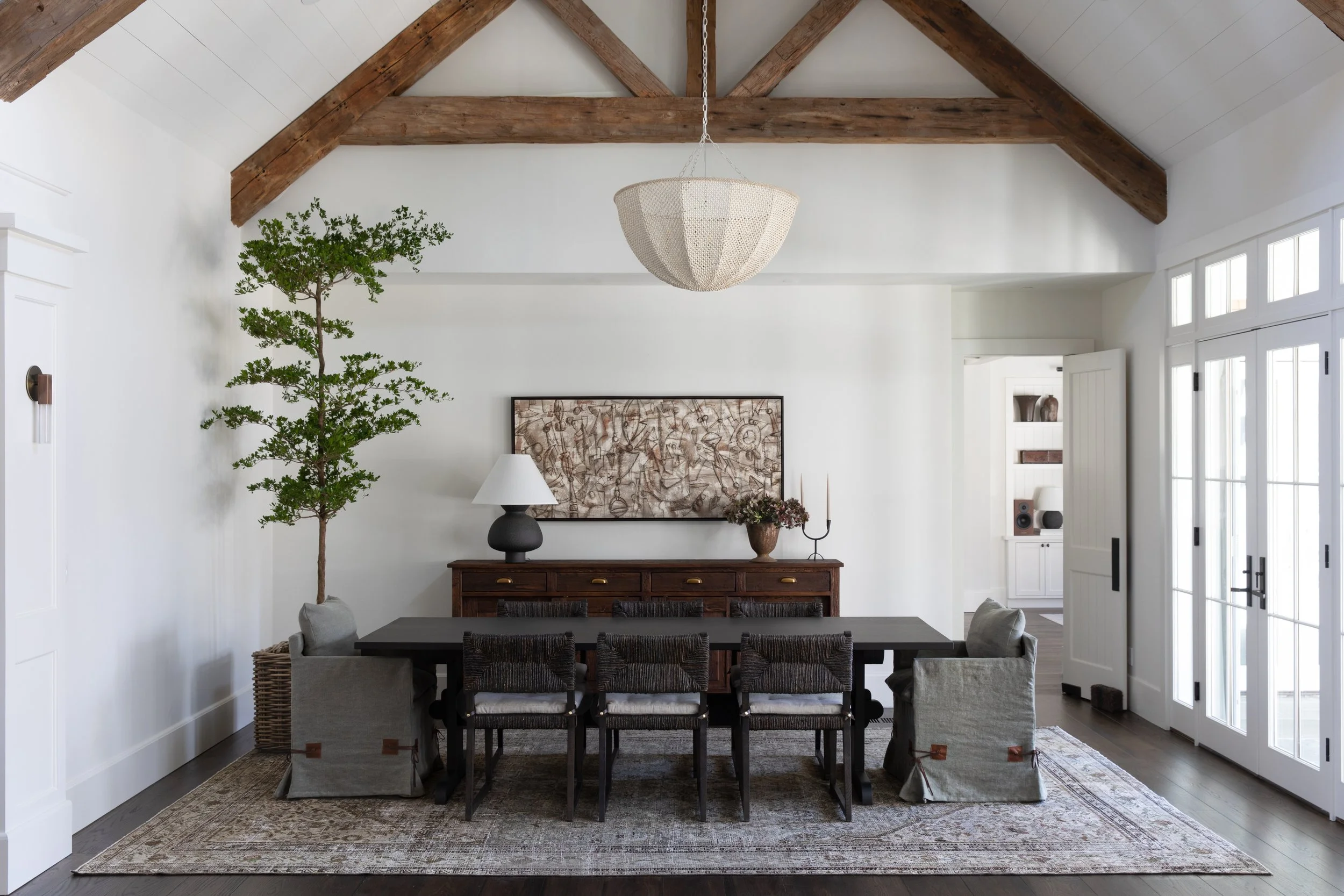
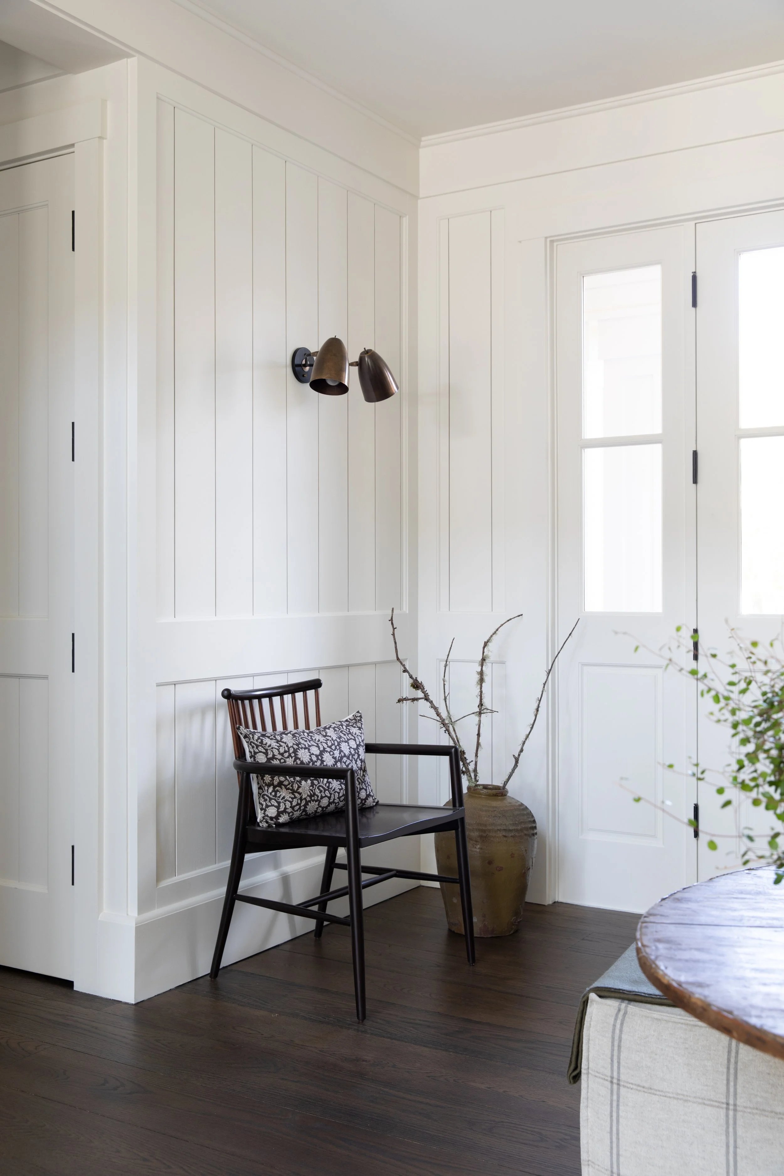
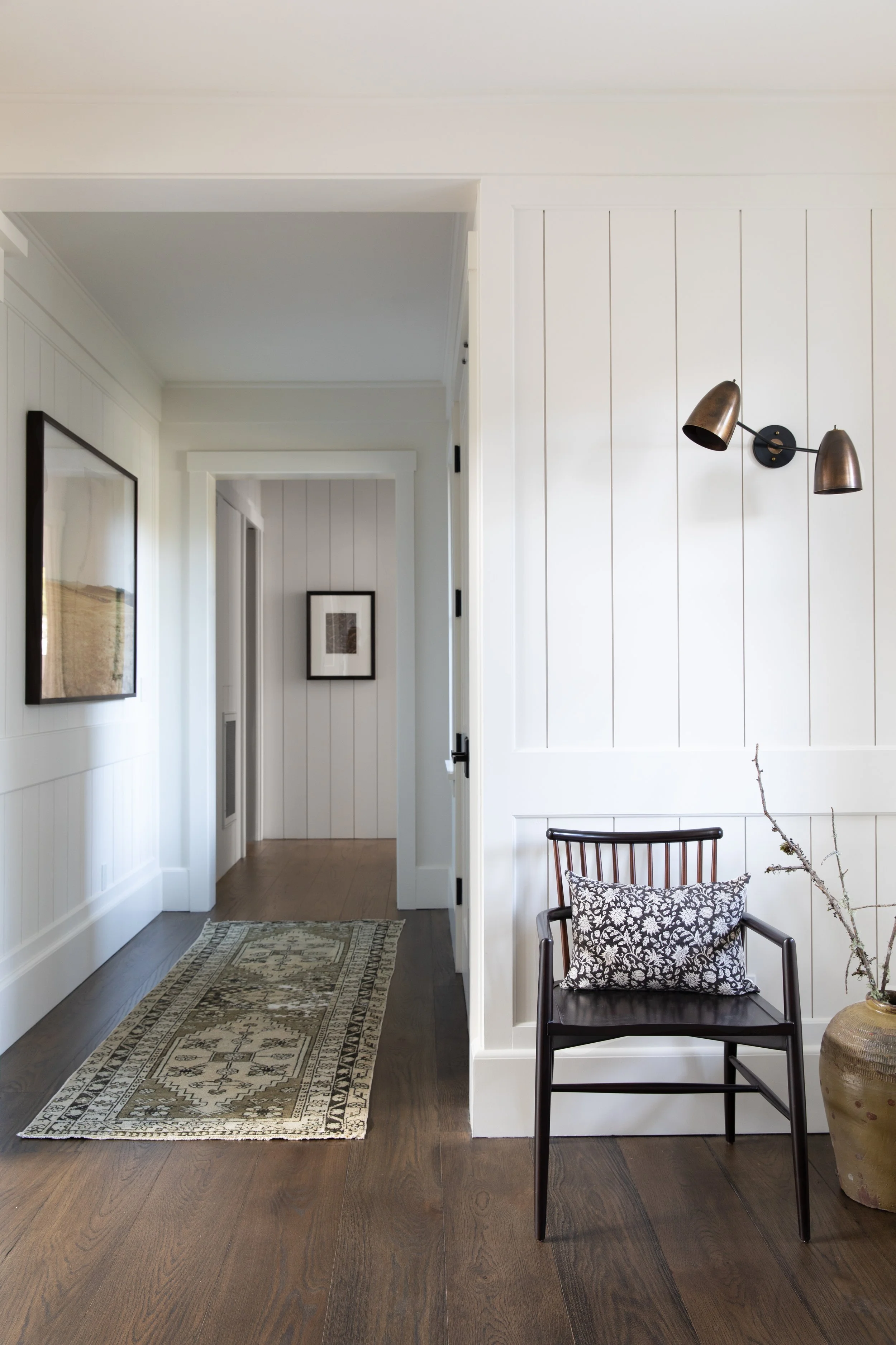
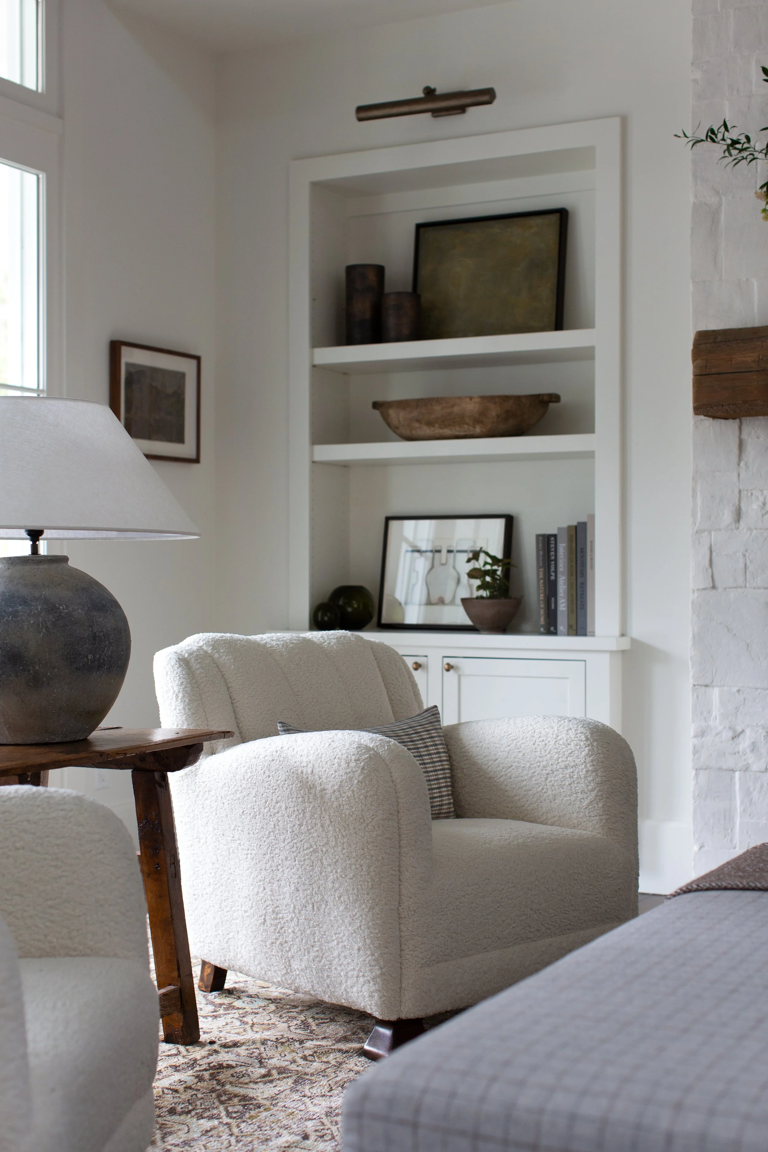
At Woodside Manor, we leaned into warm, layered whites that feel soft and architectural rather than stark. Our goal was to create cohesion throughout while allowing natural light and materiality (plaster, stone, wood tones) to do the talking.

Primary Whites Used:
Benjamin Moore White Dove (OC-17) – This was truly our foundation color throughout the home. A soft, warm white with subtle depth, it reads beautifully in both north- and south-facing rooms and became the primary wall color nearly all the way around.
Benjamin Moore Simply White (OC-117) – Slightly brighter and crisper; great for trim and moments where we wanted just a touch more contrast.
Farrow & Ball School House White (No. 291) – Used selectively in areas where we wanted warmth and a subtle heritage feel.
Benjamin Moore Bruton White – Used in the primary bathroom. It carries a slightly creamier undertone that feels elegant and calming in a more intimate, spa-like space.
C2 Paint – Wood Ash – Used as an accent in the powder room plaster and on select cabinetry. It adds quiet depth without overpowering the warmth of the overall palette.
Other than these key moments, it was really White Dove almost all the way around — creating cohesion and a timeless envelope throughout the home.
Guidelines for Selecting White Paint
Light is everything.
Always evaluate paint in the specific room at multiple times of day. Northern light pulls cool; southern exposure warms everything up.
Consider fixed elements first.
Flooring, countertops, tile, stone, and cabinetry should guide the undertone selection.
Avoid overly bright whites in classic homes.
Stark whites can feel modern and flat. We prefer whites with a whisper of warmth for depth and longevity.
Sample large.
Paint at least a 2' x 2' swatch directly on the wall — small chips can be misleading.
Tips on Paint Finish
Walls: Typically matte or flat for a soft, velvety look.
Trim & Doors: Eggshell or satin for durability and subtle contrast.
Cabinetry: Satin or semi-gloss, depending on use and lighting.
Ceilings: Flat, unless architectural detail calls for slight sheen.
Finish matters just as much as color — sheen dramatically affects how light moves through a room.
General Guidance & Philosophy
We tend to return to a small, trusted palette of whites because consistency creates harmony throughout a home. That said, we always adjust slightly based on architecture, landscape, and client lifestyle.
We primarily work with Benjamin Moore & Sherwin Williams for reliability and color depth, and we love the nuance and heritage tones from Farrow & Ball for special applications. C2 also offers beautiful depth for accent moments.
Our philosophy: white is never “just white.” It’s the backdrop that allows craftsmanship, texture, and collected furnishings to shine.